Maps in Apps: Travel Booking
Data and cartography are underperforming assets when booking accommodation
Today's post is sponsored by OpenCage, makers of a highly available, simple to use, worldwide, geocoding API based on open datasets like OpenStreetMap. Test the API, see the docs or the pricing (hint: it's radically cheaper than Google). This piece begins with a hypothesis, or perhaps aggressive claim: apps for booking travel—mainly hotels and holiday apartments—make very poor use of maps.
There are three important aspects of maps in a consumer product. The first, downstream of all the others typically, is the user experience (UX), and in this case I don’t have particular beef with the travel apps. The other two are the data product and the cartographic (design) product. Many travel apps seem to be simply passive adopters of map technology, where they use a standard UX (except those asking you to use two fingers to pan the map) and they essentially accept the map data and the styling of it in whatever format the provider packages up.
There are countless apps out there for booking a hotel. Many people start with one app, then click through a special deal to view another app. Often the map is not important, because the user knows what they want and it takes nothing more than a map confirming the accommodation is in the correct neighborhood to make the deal go forward. Other times the user is particularly interested in making sure the booked accommodation is near specific amenities, places, or access points.
Let’s compare a few popular apps, at least ones that I typically use. First we’ll go with some global giants:
Booking
Agoda
Google Maps
Tripadvisor
In addition, the apps more focused on apartments and holiday homes:
Airbnb
Vrbo
The Ski Trip
Skiing is a very quirky type of activity. For some, it never happens—you don’t ski, nor want to, or maybe it’s costs outweigh the benefits of even thinking about it. If you live in the Alps, you may find skiing is cheaper than dinner at a nice restaurant, accessible compared to other places in the world. Sometimes skiing means a morning commute by bus, train, or car, for others it’s an overnight stay on the weekend or a once a year getaway for a week. We’ll go to the last category, where people seek accommodation.
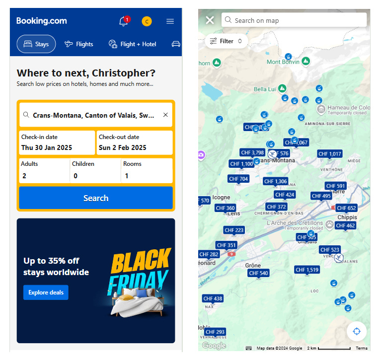
In my dream scenario, let’s say I would like to spend a few nights at one of Switzerland’s premier ski resorts, Crans Montana. Let’s do a quick search for accommodation using Booking:
We have results! We can see also we have a Google basemap. The interface has a GPS locator button at bottom right, even 2km scale bar in case we need to measure. Now, in my case, I’ll be quite demanding and say I want to specifically make sure I can walk to the slopes or a lift. I don’t necessarily need what’s called “ski-in/ski-out”, where I can get to and from the accommodation with skis on, I can do the awkward ski boot walk for a few minutes to save a pile of cash.
The problem with the Google basemap Booking uses is that I cannot see the slopes. I can see the cable car and chairlift stations as points, but with no clue where a particular one starts and ends. Google recently stopped displaying this, and the hotel apps are at their mercy. It’s something of a panic for a niche of users like me. Now what we can try is a filter for distance to nearest ski lift, but there’s not a guarantee of a not cliff in between, or highway, and in my experience the best finds are those not near a ski lift but near the slopes so you can ski even another 1km to a lift just by walking to the groomed path.
This of course highlights another issue, one that we do not have if we go to Google Maps directly. We cannot see the terrain. I am looking at what is really a sort of blank map, a pale green background implying some kind of nature, without contours, no ski pistes—I know there is something there but it’s assumed I don’t need to know. This seems fine when zoomed way out, but the fact that I can zoom in closely means I am probably zooming in looking for something. Yet find nothing. Satellite maps can help, but the assumption there is that I only want to see the green pastures of summer. If I use Google Maps it is a similar issue, but not even a distance to ski lift filter:
Now let’s compare the others. In Agoda, there is no helpful filter, and the map is the same. On Airbnb I can filter for ski-in/ski-out but it’s not clear if that’s a dubious claim by the owner (often a stretched definition and depends on snow conditions) or if it is data-calculated (from what source?)—but not even lift stations as points. Vrbo is not much different than either, but has stations:
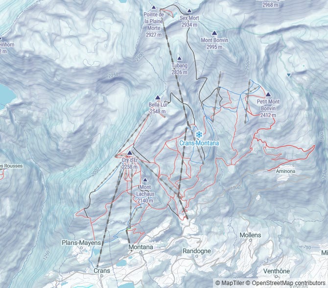
Of course, if we simply switch the the MapTiler winter basemap, sourced from OpenStreetMap, we get amazing results (even if the data is less than perfect, the style is great, and the user can understand where the accommodation is relative to the activity).
But there is a clear winner, although not as nice as MapTiler: Tripadvisor! Loading up the search, we can see that it uses Mapbox, meaning also a lot of OpenStreetMap data, but a subdued style nonetheless. This is pretty good, if you know what you are looking for, because you can see the blue dashed line for lifts and the green dashed/dotted line for pistes.
The Beach Trip
Okay, we’ve seen that booking for skiing is not really great when relying on any app that uses Google’s new, subdued, no-ski-resort-data style. Even if you can get a good hotel, the experience of booking it is pretty dull and inhibits discovery by location, rather than by looking for attributes as numbers. This time we will head to the beach on the Ligurian coast of Italy. As a traveler it will be important to be near public transit, or walking distance from a beach, so we do not need to rely on a car—but we can check parking too.
We kick off with Tripadvisor again. We can even sort it by preferring beach access in the settings, but that seems to just mean it’s walkable in a few minutes (not necessarily on the beach, equivalent to ski-in/ski-out). The beach itself is a sandy color, so you can easily see it. Train stations are also quite visible, and walking paths, crosswalks, foot tunnels/bridges also faint but visible:
Tripadvisor essentially has whatever OpenStreetMap has for rendered beaches, public transit, and footpaths, and has an added benefit of showing terrain (not something OpenStreetMap provides). I checked in Algeria, across the Mediterranean where the same inviting coast exists but there is far less international tourism for beach holidays, and the data is still quite obvious because someone mapped beaches. Let’s take a look now at some of our other apps in Liguria:
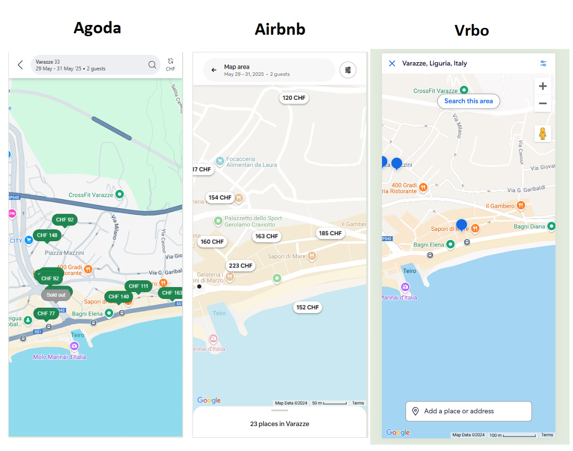
Beach is visible in all, but somehow looks more crude—in fact, it could be just coastline, if you don’t know the area (switching to satellite helps, and is often even a hack to find unmapped beach access along the Italian coast). For the record, Booking has almost exactly the same style as Agoda (both Google Maps). Airbnb meanwhile seems to be missing public transit stops! In contrast to the Mapbox styles used in Tripadvisor, the Google Maps basemap includes this “area of interest” shading that is the color of peach smoothie, often blending into the sand—so much so that Vrbo seems to lack sandy beach.
For the record, the area is quite clearly beach (with countless names) in OpenStreetMap Carto style and in a satellite view (Bing Maps):
We need go no further—it’s clear Google Maps is not very good at getting beaches extremely clear either. It might really become interesting somewhere like southern Portugal where beach access means navigating around cliffs on narrow paths too. On Booking they go so far as to make a sort of geofence around the beach to clarify where it is, while Tripadvisor has beach shading and a lot more detail on the paths and greenery around the beach area:
Checking on Bing satellite and OpenStreetMap, the amount of detail is certainly intensive, and even the Mapbox basemap that Tripadvisor uses might exclude some helpful things when looking for a nearby hotel or activity, including where you can take stairs to even reach the beach at all:
These images really speak for themselves, and leave me puzzled. Why do these travel booking companies opt for either map styles that they cannot control (and which are expensive like Google), or which they can style or even edit more easily (like OSM, which even Booking uses to calculating distances to attraction), rather than really giving users at least an option to view the best detail? While the mobile apps all give a satellite layer (my mobile simulated browser screenshots above all exclude that), satellite is still a guessing game compared to some of the detail in OSM, especially in Europe.
Product decisions?
There are likely some decisions in each company that led to the choice of map they use, very deliberately. “Less is more” sometimes is an approach to choosing basemaps for consumer apps, where the unfiltered, loud, and yet informative default style of OSM is not desirable for the average user. Adding an option to see a more detailed view is also another complexity, rather than just two simple modes like satellite and streets.
Beyond that, probably only power users (like me with my constant geospatial optimization of travel) spend a lot of time looking at the map when making a reservation, while most probably glance at the map briefly but focus on using the filters for amenities they want, like breakfast, parking, a balcony, or late checkout. The map is just a piece of the whole product.
The map also seems to very rarely be internally controlled. While many of the relevant geospatial calculations, like distance to the beach, to public transit, or to the airport, are all carefully crafted by data engineering and analysis teams, the basemap comes as a package from whoever is selling. Other tools like geocoding are also externally sourced.
For many, this means just using Google is simple, and using Mapbox might be an edgy move. The data and the style come as a bundle, with maybe a few options to adjust the style to feel in vibe with the brand (like Airbnb making it even more minimalistic), but these appear to not be cartographic choices. The displayed data itself is really entirely outside the control of whoever launches the product, because Google, OSM, or Mapbox with additional data sometimes, are controlling that (although Booking added beach geofences).
Future of travel maps
Having boutique maps is expensive, and often requires somebody in the company to have a soft spot for cartography. It can simply be too expensive and of too little relative important to the bottom line compared to other aspects of the user experience, meriting low investment—or even a relatively high monthly spend, the work is outsourced at least.
Tripadvisor is among the companies who joined the nascent Overture Maps Foundation, and this likely goes hand in hand with their use of something other than Google Maps. It may suggest that Mapbox, while remaining as a map server, may not be the basemap style used in Tripadvisor’s future either—Overture offers mostly OSM data but with additional data for points of interest. The growing influence of Overture may pave the way for more travel companies to get reliable basemap data that has relevance for their users without making any major shifts, and even saving money.
Meanwhile, OpenStreetMap is improving every minute of the day, and places with heavy tourism are particularly likely to have an OpenStreetMap user visit and make an edit (compared to more remote destinations like Tibet, the Darien Gap, or even Lapland). While some map data requires constant maintenance, mainly POIs but sometimes roads and buildings, much of the basic infrastructure and terrain in places like beaches and ski resorts need to only be mapped once to be forever useful to any map viewer.
The most likely main solution is something that probably requires deeper understanding of the user needs. I do not know the questions nor the answers, without some deeper thought—again, I am probably a very unusual user and most people don’t demand what I demand.
However, creating a basemap or data product that is tailored to needs of specific users is an ongoing challenge for real estate, travel booking, tourism, ski touring, hiking, Korean people, and many more. Sometimes that can be such a specific project that the audience shrinks, or the cost to make it grows. I encountered this problem while thinking about replicating the winter satellite map that FATMAP provided, something that probably costs a fortune to license and has only a handful of business customers with small groups of users.
Will travel maps ever cave in and flatter the OpenStreetMap community by showcasing their detailed mapping? I don’t know. And I even ask: should they? It might make finding the hidden gems of ski and beach access, convenient hidden stairways to the hiking trail or a lesser known train station, all become far too popular for more seasoned travelers who know where to look, and that’s a longtime reason why many maps do remain vague or blank—to keep the best tips hidden.


