Spatial Creativity
Does advancing map technology mean improving it, or rethinking it?
Accelerating map technology
The map technology industry is accelerating toward a more advanced future, but it is not often obvious how. The reason this is not obvious is not because you nor I are not clever enough to see it, but because it is hidden by a sort of false progress on the surface. To begin peering a layer deeper, we only need to take notice of what lies in clear view.
When advancements in geospatial technology are announced or advertised, whether as part of academic, commercial, government, humanitarian, or other efforts, what we often see are certain metrics being moved. How is the data( (or its method of collection or generation) better than in the past? More precision? More accuracy? More realistic? Higher definition? Wider coverage? Cheaper? Faster?
We also see attributes of the data growing, sometimes meaning a new column is added to a database. Map data becomes spatio-temporal, adding a 3rd or 4th dimension. Buildings become 3D. A new spectral signature is used.
Of course most (maybe not all) of these advancements are meeting some customer need, offering an improved product or service. Many also are cutting costs and making expensive activities become cheaper and more accessible. This is parallel to the progress of many aspects of technology, beyond maps and geospatial.
What is progress?
If you read the newsletters and scroll the feed, it seems that the future of maps is very predictable. Everything will be 3D. Everything will be photorealistic. Updates are real-time, maps are self healing. Formats are standardized, interoperability is maximized. Device positioning is incredibly precise, the cartographic styling is beautiful where its not a photograph, and of course, no data is missing—it is one day all mapped, even as the world changes almost faster than it can be mapped.
This is all progress, on paper. It is driving mapping toward being as reliably delivered as cooking or pottery. These are crafts, and with the right tools, it can be done really to perfection, as far as the consumer can judge. In maps, the craft also can be perfect, with the right tools (LiDAR and SAR and crowdsourcing and Gaussian Splats and RTKs and so forth)—we can eventually model the world so well that we have a digital twin of the way it looks as well as functions.
I think, however, this fails to understand the telos of mapping, the purpose the technology itself can and should accelerate toward. These advancements are valuable yet one-dimensional. They present a telos of replicating reality, of ultra-fidelity in modeling the earth.
Multidimensionality
The evolution of geospatial technology certainly should not be one dimensional. In the above mentioned cases, the progress itself may actually involved multiple tools and inventions that are not planned together, nor easy to use with one another, which hints at some tendency toward multi-dimensional progress.
To consider another way of thinking about dimensions, look at how roads are mapped, and measured. As a driver, you see markers indicating the mile or kilometer, and you see signs saying how many units of distance to the next waypoint. This is one dimensional, and in more professional use becomes the linear referencing system (LRS). It is not much different than downloading a file and seeing what percent is done. Train and underground systems can work this way as well, even discounting realistic distance and simply focusing on how many stops until a destination.
Should maps and models of these systems also strive to be a perfectly realistic digital twin? Clearly, the answer is no. Not always, maybe at times.
The true telos of mapping is not to map everything, but should be to overcome the obstacles to making maps consumable. Some obstacles can be a lack of random access memory (RAM), or simply information overload in the human brain.
Any GIS professional, much less an architect of various system types, knows that data and apps don’t need to use every tool in the toolshed, nor every column in the database. When mapping road damage or a blockage on a train track, a one dimensional position along the network is all that is needed as far as giving location to a service team, and visualization also can be done with a single dimension or pseudo two dimensions (a point on a line representing the distance along the line).
Similarly, a timestamp is not always needed, and even if used is sometimes an attributes rather than a dimension (like a distinct name or category rather than a value along a scale).
Less is more, or more is less?
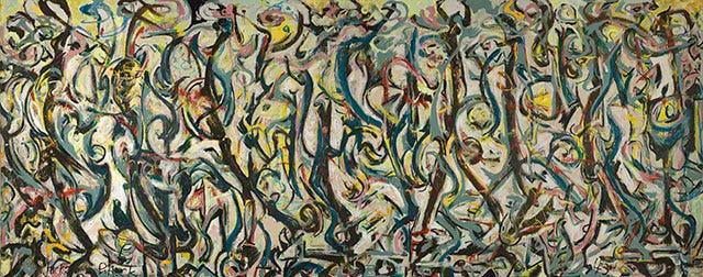
In the 20th Century, art took some weird turns. Possibly the wrong turns (sounds subjective, as art is). Abstract art greatly reduced the content and complexity, arguably, of paintings, for example. In a similar vein, movies from the 1990s onward also took a strange turn, as computer generated imagery (CGI) became impressive, then suddenly overused, arguably. If you are asking me both are examples of two extremes—a complete rejection of the richness in methods and tools a field can use, and in the other case, something a step beyond embracing it all.
With painting and film, both are, in a way, products seeking to sell to an audience. Abstract expressionist painting, as well as Marvel or Planet of the Apes films, all found their audience and significant success. They served a purpose and were in no ways failures, but I would argue that they are still detours rather than grand leaps ahead in their fields.

To put it in other ways, you might argue that films like Lawrence of Arabia, Jurassic Park, or various paintings, show the ability to use cutting edge technology and prove new advances, while also showing careful selectivity about when to use tried and true methods to do something new or better.
That’s all a whole different essay, so let’s not make a tangent of our own.
Mapping smarter
I think some of the most profound advances in the mapping industry will not come from a raw growth in technological capability, but instead in a creative application of existing tools—as well as a sort of cross-pollination within the field and across other disciplines.
A simple but interesting example is Mapbox Terrain-RGB tiles, from almost 10 years ago. This used red/green/blue color values in pixels to encode elevation data in a simple PNG image rather than a more complex file format, and had many other advantages.
Another interesting case is the use of Hilbert curves in S2 mapping systems, where it is possible to know if locations are close to one another by comparing the sequential proximity of their IDs, as well as their hierarchy (similar to quadkeys—a reuse of quadtrees).
Reducing dimensionality
When maps use three dimensions, that does not always need to be longitude, latitude, and altitude. Finding clever ways to store other data in the x/y/z fields is a similar path toward unlocking new possibilities. Similarly, instead of adding 3rd and 4th dimensions to map data—or making it a part of the display in mobile and web apps—it is interesting to consider when minimalizing to one dimension can make complicated data be something elegant to the end-user.
This down-scaling is actually a key part of many machine-learning applications. Embeddings, a way of taking high dimensional data and representing them in a lower dimension, are often cited as a key part of the function of large language models (LLMs), and can very much be applied toward geospatial data. This can sometimes mean remodeling data, for example rather than giving every road in a map database a category, instead list every category name with a value of 1 or 0. Vectors and matrices can quickly change how efficient it is to crunch numbers and compare similarity.
Different systems
Cartesian systems are often very central to cartography (of course). We use longitude and latitude, and even in hypothetical words or point clouds we have an x and y (and z). Meanwhile a polar system, with a radius distance from center and an angle as an x and y, are not Cartesian. This is like what we use in space—Earth is 1 AU (astronomical unit) from the sun, and we might measure other objects in space by direction and distance from the sun or earth, or from the center of a galaxy.
S2 cells mentioned above are also an example of another way of thinking about space, though it is still anchored in cartesian system. H3 cells are also similar, but with their own advantages. There may be smarter and more creative ways to represent 3D geospatial data, such as in voxels or toxels but which also represent curvature of the earth, and which nest within each other hierarchically in a quadkey approach (a cubekey?).
Increasing complexity
In computer vision, there is a system where the observer (camera) has pitch/roll/yaw, and sometimes where depth in an image, or relationship of other spatial data to the image, depends on distance and angle to the observer. A magnetic compass angle is also quite different from the angle between two things on a Mercator map, depending if north means magnetic, true polar, or grid (map) north.
Could augmented reality also highly depend on distance and angle—horizontal and vertical? While some satellite maps rely on temporal attributes, mapping things or measuring in augmented reality can also rely on time, motion, dynamic distances, and ways of indexing things in such multidimensional space.
Mapping on the Moon or Mars can be like earth, but the Cartesian systems use a different foundational reality. But in a map of the universe, can the same database tell you if a rocket launch pad is located in Florida or on the slopes of Mons Olympus?
Thinking outside the cube
One of the most important things about maps throughout history is not that they increasingly become more capable of modeling the world in great detail, but that they actual transform the world into simpler and simpler models fit for purpose.
New modes of transportation and travel, the merging of physical and digital environments, expeditions into unfamiliar environments, and changing landscapes all certain call for higher technical capabilities in data collection, but for the end user will likely require unprecedented creativity in how to make a representation of the world be easy to understand and interact with—easier than a direct connection with that reality.
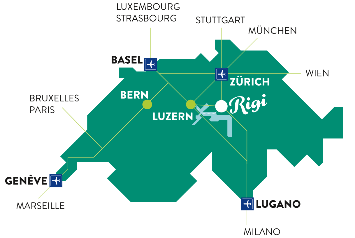
The biggest challenge for the largest number of people will be in transforming the user experience of maps. It will be knowing when to ditch using a literal map of the earth, to scale, and creating something like a metro system map that preserves network integrity and ignores the shape and distances in a city. We need a maximum amount of available data, and a skilled minimum of displayed data, as well as systems that turn reality into a digestible fiction.
Geospatial has a huge need for creativity, otherwise we are speeding toward only a copy of the world—a digital twin—that we forget how to reduce to elegant components that avoid bloat and overload. To keep the increasingly complex systems and densely mapped world consumable to those who use and read maps, the path forward requires rethinking how we see maps and space.


