Unstructured Reality: Digital Twins and the Symbolic Map
How capturing reality is expanding databases, but not changing maps
Somewhere in the course of human history, cartography made a sudden leap from abstraction into empiricism. This leap changed how we think of maps, expanding (but not replacing) symbolization of reality toward a modeling of reality.
Before this leap, mapmaking could be split into two streams: data collection and data visualization. The former is how we capture reality, and the latter is how we perceive reality.
Data Collection
Our first stream, data collection, is an ancient practice something like the ethos of OpenStreetMap—map everything that exists. Plot its location, create a taxonomy, categorize it, enrich its attributes.
This is not really cartography, but more of a surveying activity. It is certainly empirical, and like many sciences and disciplines, especially concerning the physical and natural world as well as anthropology, linguistics, and so on, seeks to catalog what exists and create a system of classification. It is of course based profoundly on human observation—the precision and accuracy are limited either by the perspective of the data collector, or by the mathematics available.
Before the leap to empiricism, this first stream may not be very structured. All the spatial data about a place, let’s say Japan in the 1600s, may be stored in a single library, but as a sort of “data lake” with varying formats. These are the formats in which the person who surveyed, or recalled from memory, or conducted some crowdsourcing, recorded it. These are formats like paper maps of town layouts, artistic depictions of mountains, written addresses or names of rivers, detailed sketches of coastlines, and so on.
Someone making a future map may aggregate data (in the form of text, numbers, drawings) from these sources, which then may be referenced decades later for another map, and on down the line.
Data visualization
The second stream is about display. This is what sometimes in the geospatial field comes to be called “storytelling”, or might be cited as “turning data into information”. It can be these things, maybe not always. What differs this idea from our first stream is that it filters from the great data lake of “all map data available [to a particular cartographer]”, choosing what is needed for this case, and choosing how to present it.
This is where the aggregate data comes into play—but not simply as a way of passing on all recorded spatial knowledge, but instead curating a selection of it for a specific need, for example digging through the archives to find the locations of all river crossing along a specific river, or passages through a certain mountain range, or the names of all peaks visible from a single viewpoint. The mapmaker decides on which data to use, which to exclude, and how to display it.
In the modern world, you can end up with beautiful and very scientific maps, displaying coastlines exactly as surveyed but with dramatic license on coloration and texture. At the same time, you may see tourism maps—perhaps for skiing or hiking—that very much shows the artist’s “impressionistic” casting of the landscape. It is certainly still useful, but not always for doing literal measurements.
Abstraction and Empiricism
With these two age old streams of mapmaking, the data attempts to be empirical and capture reality. The maps or other visualizations, however, are fit to a purpose, and try not to reflect reality—copying reality precisely—but are meant to represent it. The representation is where abstraction comes into play, and symbols become useful.
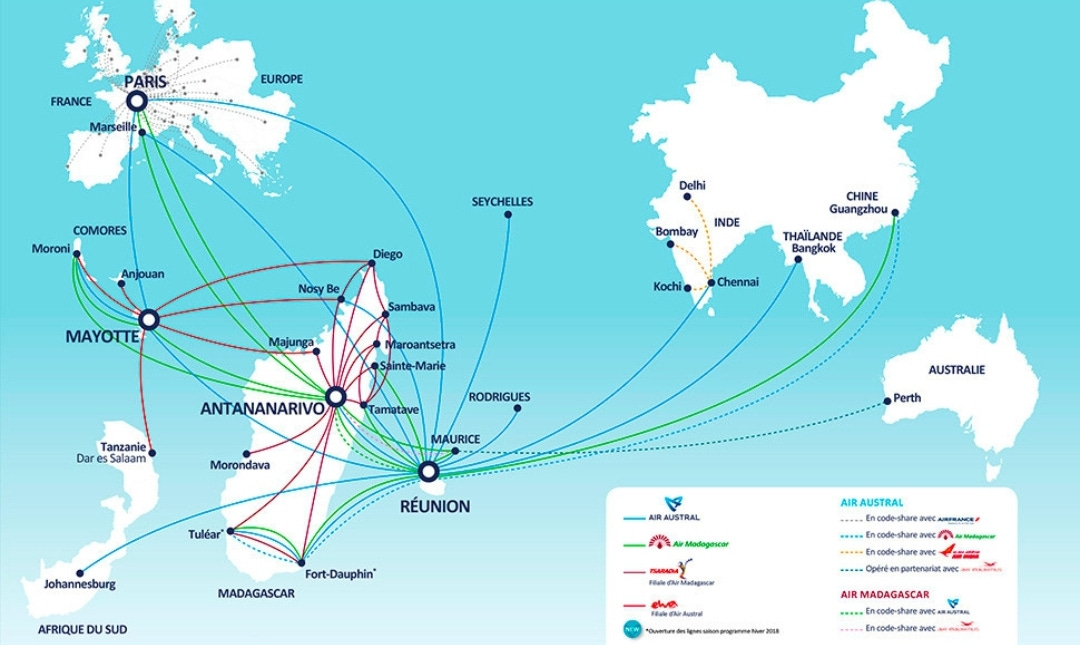
Most vector maps we see today are symbolic maps. There is a symbol for roads, for different points of interest, multiple colors are used to fill polygons (blue for water is often universal it seems), there are contour lines and labels for elevation, and there are symbols representing relations between data as well. Consider the map below, of air routes for Air Austral:
The map above, like many or most, has no need to show its audience the world itself. It needs to only show slices of the world, and of course tell a story.
Data structure is extremely important for modern mapping. Any map-like product can be either a raster or a vector (or maybe some third thing). The situation is similar for any kind of illustration or text document. Some PDF files are just scans of a document, and they are forever frozen with no ability to go back and change the font color or size. Others are editable. These editable text documents, or editable graphics like an SVG file or a Power Point presentation, have layers of objects with properties, unlike the document scan, and also unlike a photograph.
The Raster Map
Perhaps the current day offers some special solutions, but in recent geospatial history, raster data does not generally have the ability to turn part of it on and part of it off without first converting to vector—you can manipulate pixels, but not really entities in the data like buildings and lakes and roads.
Raster data is essentially a photograph, or something like it—something captured by a sensor and which often comes all in one piece.
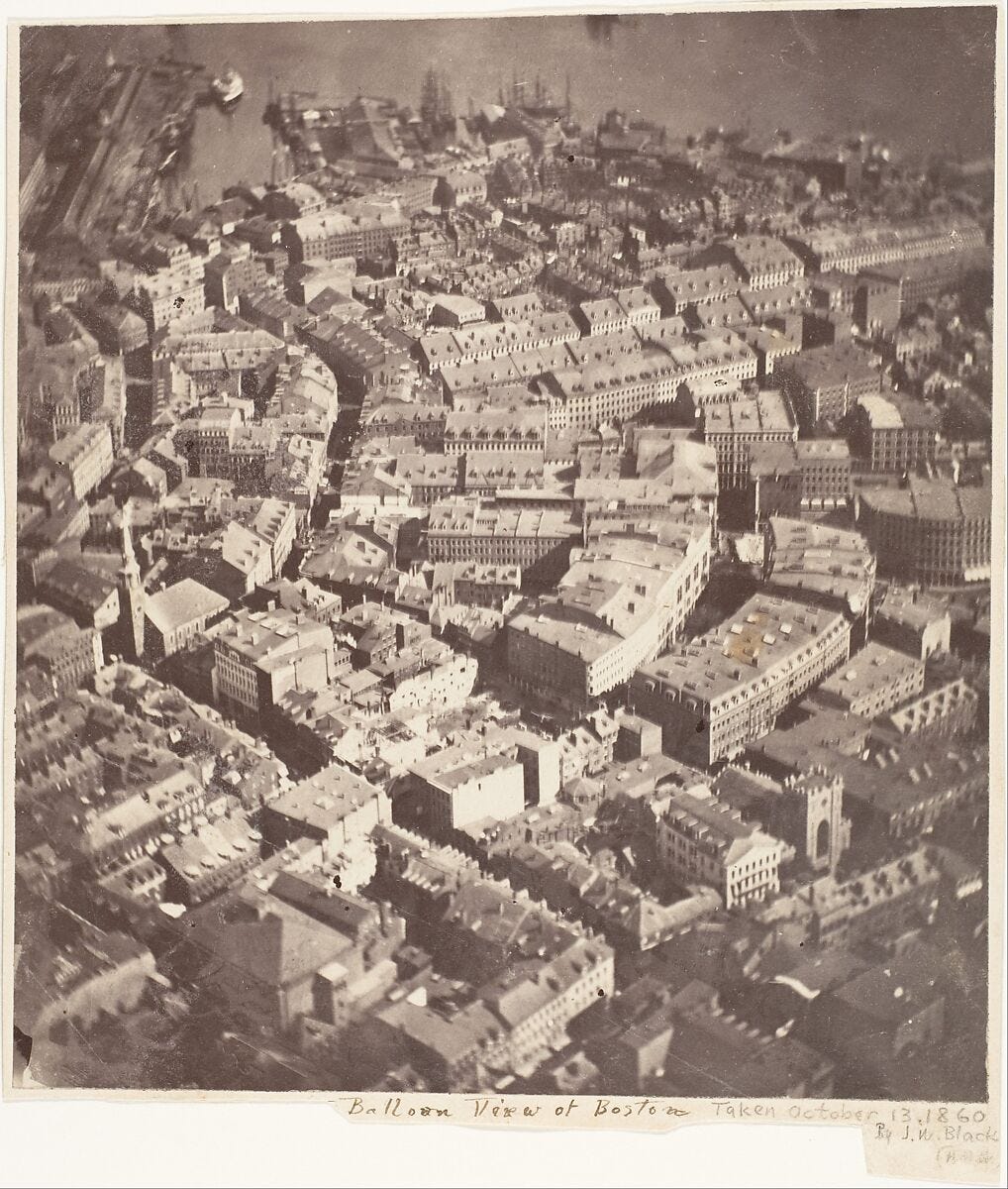
The earliest aerial photography was taken in 1858 from a balloon in France, and is lost. The next earliest comes from the USA, giving a view of Boston in 1860.
This was certainly not geotagged in a GPS sense, although something like a Visual Positioning System (VPS) could probably give a quite accurate estimate of the balloon observer’s longitude, latitude, and altitude. Despite this lack of geotagging, photos like this were quickly used in wartime to find targets and plot them on a map. The photos were used as a source for plotting vector map data.
Fast forwarding a few wars later, aerial photo surveys began to establish themselves as a map all on their own, and then satellite imagery as well. The imagery itself is not really a map in technical terms, but can certainly be used as one, or used to make one.
Any map produced before computers was arguably a raster map when finished. This means the data used to make the map—in its many layers—was flattened into a piece of paper or other material, and could not be separated. There was little to no interactivity, and the map was all or nothing. This is a useful way to think of raster data. Computers do change this, however, and so do photographs.
Old web maps, and some modern ones, are also raster data. These come in tiles—just like the tiles on a bathroom floor. There is no filtering, except maybe by the color value of pixels (or other sensor values). Essentially, these are all images. Each pixel has a value, and can have a corresponding color. Sometimes the color is the real world photographic color—capturing reality—and sometimes a symbolic color, like a landcover category or an elevation value.
Let there be structure
Computer vision and remote sensing go together quite well. The past few years have been especially revolutionary, with tools like Segment Anything being used to more quickly than every turn a raster image into vector data. This has been possible with machine learning for some time, but Segment Anything has opened the gates and made it more accessible than ever, with respectable results. Applications to geospatial data and satellite imagery were immediately apparent.
Computer vision, alongside other machine learning disciplines, demonstrates a very important corollary of this great leap in cartography. They represent the ability to, as the trope again goes, “create information from data”. It might be better said that it enables “creating structured data from unstructured data”.
By many definitions, media like images or videos are unstructured data, even if they do have useful metadata. Querying that imagery for specific things like swimming pools has not been possible over the past century, unless someone first goes through and finds the swimming pools manually.
With remote sensing, something similar to symbolic AI was possible. Basic sets of logic and rules could be used to determine an output. A common use of satellite imagery with multispectral sensors is the normalized difference vegetation index (NDVI), basically a way to make a map of where plants exist (bucketed by density per pixel though). A computer basically says “if the red and near-infrared sensor value is at some level, make the pixel more green”.
This is certainly cool stuff, but the technological achievement is more in building and launching the satellite than in interpreting the imagery. Creating the data source, especially in increasing better definition and multiple sensors, has paved the way for what can be built on top of it.
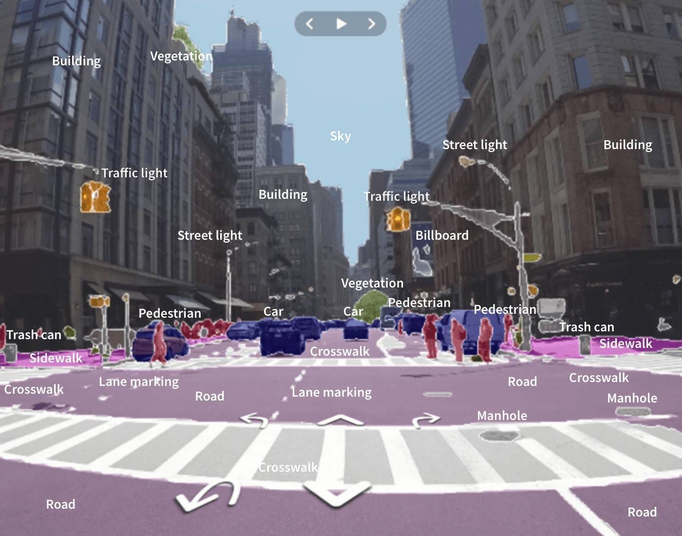
Computer vision can be used to segment a whole photo (finding individual entities), and then continue label or classify each segmentation. Furthermore, things like depth perception and horizon estimate can really start to create vast new data from raw images.
A pattern to see here is that unstructured data often needs to become structured if it is to be reused, filtered, transformed, and then visualized. A lot of manual legwork has gone into this by creating training data, labeling entire images or parts of images, tracing the outlines of different entities.
Supervised learning means ingesting training data from a satellite image or a street scene, and learning to create segmentations and labels for other images. With unsupervised learning, something like an aerial image can be ingested and then clusters and patterns can be found. It is often these two outputs that become ripe for making maps: either a structured vector map of every entity in an unstructured image, or a structured vector map of the patterns found (like hotspots with intensity values).
Entire chunks of cities could be contained in an aerial photograph in the early 0th century, with no real structured data existing on all the buildings, bridges, and businesses within it. Translating the images into a vector dataset could take years of drawing or digitization. Machine learning has removed these constraints.
Symbolism
The act of vectorizing raster data often means funneling a snapshot of reality, or some pool of larger data, into a structure that can be symbolized. Consider the following image, from SwissTopo’s SWISSIMAGE collection showing the center of Luzern:
Now look at OpenStreetMap, where is it all mapped as symbols, very much manually. The symbols closely resemble reality in order to represent it, but almost nothing about the reality is 100% preserved—it is simplified in order to give a map user the information they need.
The aerial image can be great for finding a good place to swim but not for finding a shop that sells cheese. The vector map (which may use raster tiles, some entirely other issue) also has way too much information, since it is unfiltered for a specific use like displaying only cheese shops and the paths to get there.
Meanwhile, in Google Maps and more I can search for cheese—then the map displays a few pins. The symbolic map is morphable here, using graphics to represent only what the user needs, based on a query to the database, while the database may draw on various structured and unstructured sources, originating in human survey, AI, and more.
Reality Capture
Everything that goes into making the global map database behind Google Maps or OpenStreetMap involves the idea of capturing reality. There is street view, there are reviews, photos of the food, satellite images, terrain maps, real-time traffic information, even air quality maps.
If you doom scroll LinkedIn, and you work in the geospatial industry, you certainly saw an uptick in 3d maps themes since 2020. This was right after the HD maps buzz. Both of these have ended up coalescing somewhat into the category of digital twin.
There are a variety of definitions for digital twin, with little exact agreement. The name does speak for itself, however: it is data that is paired with something in the physical world. Twin does not necessarily mean a copy—not all twins are identical. There is some reflection of one object in the other, and the physical entity is understood to be the “real” one (even if the digital version existed first, like a construction blueprint).
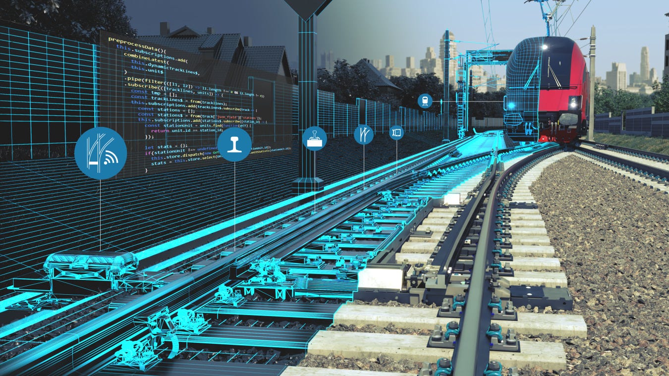
One of the best applications and explanations of a digital twin that I ever encountered was in a presentation about management of British railways. There was not one digital twin, but, like good map vector day, multiple layers. It was extremely important not only to separate different entities and components, but also themes and layers—otherwise the model is just a visualization with no data.
Symbolizing Reality
Digital twin is often cited as simply a 3d map, or simply an HD map. Neither of these are wrong, but what is significant is that it is actually not a simple leap to go from a 2d symbolic map to a 3d clone of reality. Symbolic maps traditionally have the advantage of scaling well—you can depict all of Japan, or all of the earth, using a symbolic map, because complexity is reduced.
Making a digital twin of the world, much less of the entire national railway system of the UK, Japan, or Switzerland, means an overwhelming amount of detail, if you want to twin everything. That detail becomes extremely expensive to gather, store, query, and display and demands a worthwhile use case to justify such money, compute, time, and brainpower. Why store 3d models of every switch on the national railway network if a simply 2d symbol can do? Or even a 3d symbol? Why model the component geometrically instead of store all its attributes in a structured database?
In truth, many of these twins are probably not a 100% 1-to-1 copy of their real world sibling. Others—especially infrastructure where the CAD model was built first and the physical hardware assembled to spec afterward—almost certainly are. In this second category, this twin is actually very much a vectorized dataset, that could be interacted with, queried, measured, filtered. But symbols still are an efficient way to visually explore the data before making queries or calculations of the deeper attributes attached to the symbols. No 3d model is needed as the default view.
Rasterized Reality
Using a satellite to make a 3d model of Rome from above, or street view imagery to make a 3d scene of Sunset Boulevard, or an iPhone LiDAR scanner to sculpt a digital model of an Easter Island Moai—all of this is certainly 3d, and certainly a snapshot of reality, but rasterizes everything again. A 3d scan is unstructured. All this needs to be overlaid with some vector dataset in order to assign attributes, like the address of a building, the speed limit of the road, or the material used for a statue. One needs to know where one entity stops and another begins, otherwise it is only a more immersive photograph.
In a truly vectorized digital twin of the railway system, one can toggle off the railways and show only the bridges and power lines, when troubleshooting to identify where power lines cross bridges. In a rasterized 3d model, it is just a copy of the world including the way that the world itself is a single reality, and we cannot in person turn off the tree layer in order to find the streams and paths inside the forest, beneath the trees.
Querying Reality
A huge advantage of modern and computerized mapping is that the world can be queried. This was simply impossible to do at scale a century ago. Even a decade ago, it would be incredibly advanced to be able to query satellite images on the fly for data within them which had not been manually digitized. Maps themselves have almost always been reality displayed in symbols, never a copy of reality.
A digital twin may still use symbols to visualize itself, or even a boring dashboard. The database is the twin, and the visualization of that data can sometimes look visually like a mirror of reality, sometimes now.
A database with every single component of an airplane is an excellent digital twin example. Any entry in the database could include a serial number, a graph of what the component is connected to and how, who manufactured it, servicing date, a CAD model of it, and the component’s location on a “map” or model of the plane. The map itself is not the twin, but just one way of displaying an extremely detailed dataset that captures the reality.
Digital Twins as Graphs
Modeling an economy, an ecosystem, or a social network is very much an overlap with the concept of a digital twin. Building a perfect model for such incredibly complex systems can be impossible—as soon as you think the model is complete, the reality is changing faster than you can sense. Not even AI can keep up, and transformations are difficult to predict.
Modeling a specific layer of one of these—for example all waterbodies within an ecosystem, or the physical shipment of goods by rail in an economy, becomes easier due to simplicity. When modeling these things, surveying and displaying the physical layout is only a foundational step, exactly like showing a basemap for a geospatial project. Modeling the system that operates within those physical bounds is the real task at hand, and this is where the digital model becomes twinned with the physical beast.
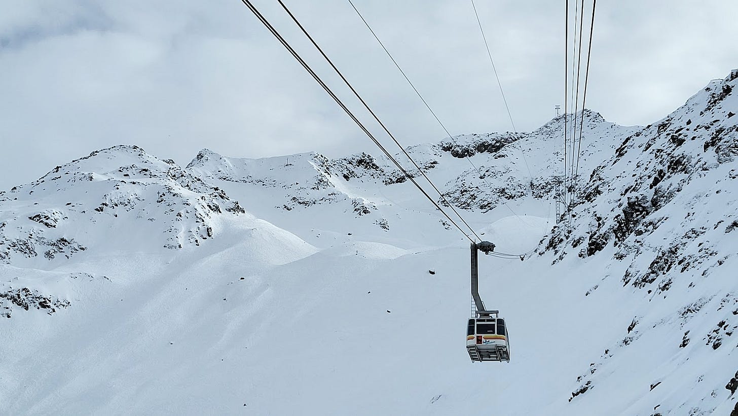
A 3d model of ski resort, like you may find in FATMAP or other apps, is not a twin of the mountain landscape. It cannot alone do much better than a webcam or 1000 webcams, if not combined with APIs about piste and lift status, and weather conditions, and snow depth, and avalanche risk, or sensors that actually detect an avalanche, wind gusts, or how many people are on the resort at the moment. All of this is much less about a 3d model than about a systems diagram and sensors.
The digital twin itself must absolutely be structured data—broken down into components and layers. It also needs to have some relationship to other data, perhaps in the form of a graph database that models what is connected to what and how so.
Empirical maps
Maps of the 21st century are very much empirical and realistic. Different map projects will seek to conserve relative shapes, sizes, and angles. We have longitude and latitude locations for points, and the nodes in a polygon, and estimates of precision within centimeters. Satellite images have a corresponding measure of degrees or meters per pixel, and the curvature of the earth is measured and remeasured.
Artistic and symbolic representations, however, still reign. They are stylized on top of aerial imagery or building footprints. We still represent cafes with a coffee cup and restaurants with a fork and knife, rather than a 3d model of the building itself or a live view of its status. Users of consumer maps certainly do not have some game-changing use of the 3d data seen in Apple Maps or Google Maps—it’s only a nice and charming thing to see.
The vectorization of these photographic, laser, and other 2d/3d reality captures is one of the true advances in mapping technology, which will result in immensely more data being available—a potential catalog of every object in the work, indexed by located and able to be visually inspected based on its last snapshot. But this is not twinning—twinning is anchored in sensors, where a thorough cloning of a system must happen and then a frequent signaling of any change is communicated. This depends on vectorization, but is not the vectorization itself.
Digital Twins are DIY
When you need a digital twin, you will need to often build it yourself through very careful survey. New methods of mapping and sensing can certainly help—including crowdsourcing—but these only visualize the subject in an unstructured way. Structured data is extremely difficult to collect in an automated way, especially at super broad (global) scale, or super deep (hyperlocal) scale. Most truly impressive digital twins are cases where the model of a system existed first, and then the physical reality was built to specification.
In the end, maps are still about symbols, and we will always subjectively decide how realistic the symbols are, how to distill and communicate unstructured data in a structured way, reducing complexity to communicate a story.








Well paper maps still have the only address grids: https://www.jidanni.org/geo/house_numbering/grids/define.html